MatPlotLib 画图集锦!
2021/4/17
简单总结一下用matplotlib画图的结果!
MatPlot作图Preliminary
起手与作图基础
肯定要从import起手啦:
import matplotlib.pyplot as plt
- 开一张画布需要:
fig, ax = plt.subplots(figsize=[8., 6.])
- 画完图之后需要添加图例,使用(记得在曲线中加上
label):
ax.legend(loc="right")
- 加入横纵坐标轴标签:
plt.xlabel("Width  /  Initial Channels")
plt.ylabel("Accuracy")
Color
支持的颜色有下面这些:
使用seaborn扩展似乎还有更多颜色,但是问题不大(这些颜色难道还不够吗?)
朴素画图类型陈列
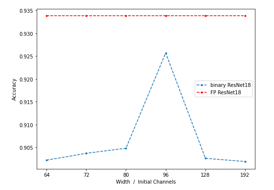
折线
以2021/4/16汇报用折线图为例:
fp_baseline = [0.9338, 0.9338, 0.9338, 0.9338, 0.9338, 0.9338]
accuracy_width = [0.9022, 0.9037, 0.9048, 0.9257, 0.9026, 0.9019]
width = [0, 64, 72, 80, 96, 128, 192]
fig, ax = plt.subplots(figsize=[8., 6.])
ax.plot(accuracy_width, marker='.', label="binary ResNet18",linestyle="--")
ax.plot(fp_baseline, marker='.', label="FP ResNet18",linestyle="--", color='red')
ax.set_xticklabels(width)
ax.legend(loc="right")
plt.xlabel("Width  /  Initial Channels")
plt.ylabel("Accuracy")
画图结果如下:
柱状图
同样使用2021/4/16汇报用到的柱状图,同时是比较高级的并列柱状图。
s_full = [1.0000, 1.0000, 1.0000, 1.0000]
s_bina = [0.8934, 0.8968, 0.9629, 0.9046]
s_tern = [0.9653, 0.9874, 0.9933, 0.9747]
s_2_b =  [0.9752, 0.9755, 0.9847, 0.9747]
fig, ax = plt.subplots(figsize=[8., 6.])
x = [-0.6, 2.4, 5.4, 8.4]
bar_width = 0.35
x_major_locator=MultipleLocator(3)
ax.xaxis.set_major_locator(x_major_locator)
plt.bar(x,s_full,0.35,color="darkblue",align="center",label="FP",alpha=0.5)
plt.bar([i+3*(bar_width+0.05) for i in x],s_bina,0.35,color="lightskyblue",align="center",label="Binary",alpha=0.5)
plt.bar([i+2*(bar_width+0.05) for i in x],s_tern,0.35,color="royalblue",align="center",label="Ternary",alpha=0.5)
plt.bar([i+(bar_width+0.05) for i in x],s_2_b,0.35,color="blue",align="center",label="2-bit",alpha=0.5)
x_labels = [" ", "fc1", "fc2", "fc3", "total"]
ax.set_xticklabels(x_labels)
plt.xlabel("Layers")
plt.ylabel("Cosine Similarity")
ax.legend(loc="upper right")
画图效果:
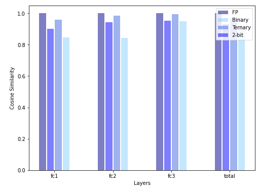
这里的要点是使用plt.bar画柱状图,自定义柱子的宽度对齐坐标轴。
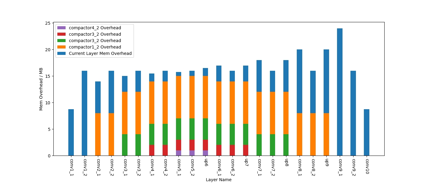
堆积柱状图
ax.bar(layer_name, base_mem, width, label='Current Layer Mem Overhead', color='#1f77b4')
ax.bar(layer_name, long_sc1, width, label='compactor1_2 Overhead', bottom=base_mem, color='#ff7f03')
bottom = [base_mem[i] + long_sc1[i] for i in range(len(long_sc3))]
ax.bar(layer_name, long_sc2, width, label='compactor3_2 Overhead', bottom=bottom, color='#2ca02c')
bottom = [long_sc2[i] + bottom[i] for i in range(len(long_sc3))]
ax.bar(layer_name, long_sc3, width, label='compactor3_2 Overhead', bottom=bottom, color='#d62728')
bottom = [long_sc3[i] + bottom[i] for i in range(len(long_sc3))]
ax.bar(layer_name, long_sc4, width, label='compactor4_2 Overhead', bottom=bottom, color='#9467bd')
最重要的要点是,bottom不能直接列成它的上一层,而是要在数值上累积起来。
画图效果:
箱图
Advanced Plot Trick
自定义横坐标数值
可参考折线部分。这个技巧需要仔细调整横坐标刻度(包括出现的刻度点和刻度间距),在调整完后时候一个list保存需要打上的标签(可以也一般是一堆字符串),example:
width = [0, 64, 72, 80, 96, 128, 192]
ax.set_xticklabels(width)
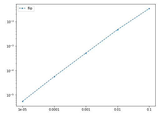
坐标轴对数表示
如果希望体现曲线的指数特性,可以将坐标轴对数化,需要的操作是:
ax.set_yscale('log')
画图效果如下:
并列柱状图
指一个刻度对应好几条柱子的柱状图,见上一节中的示例。
标注点
使用plt.annotate在需要的地方进行标注,其中第一个input是需要标注的文本,第二个元组xy表示标注的点的位置,第三个元组xytext表示标注文本的坐标,实例代码如下:
import matplotlib.pyplot as plt
from matplotlib.pyplot import MultipleLocator

fig, ax = plt.subplots(figsize=[8., 6.])
x_major_locator=MultipleLocator(1)
ax.xaxis.set_major_locator(x_major_locator)

txt_STE = ['lr={}'.format(round(lr,2)) for lr in Best_lr_STE]
txt_CDG = ['lr={},\nε={}'.format(round(Best_lr_CDG[i],2), Best_epsilon[i]) for i in range(len(Best_lr_CDG))]

plt.xlabel("Different Batch")
plt.ylabel("Loss Decrease")
width = [ ' ', '1', '2', '3', '4', '5', '6', '7', '8', '9', '10']
ax.plot(delta_loss_STE, marker='.', label="STE grad",linestyle="--", color='blue')
ax.plot(delta_loss_CDG, marker='.', label="CDG grad",linestyle="--", color='red')
for i in range(len(txt_STE)):
    plt.annotate(txt_STE[i], xy = (int(width[i+1])-1, delta_loss_STE[i]), xytext = (int(width[i+1])-1.35, delta_loss_STE[i]-0.015))
    plt.annotate(txt_CDG[i], xy = (int(width[i+1])-1, delta_loss_CDG[i]), xytext = (int(width[i+1])-1.35, delta_loss_CDG[i]-0.015))

ax.set_xticklabels(width)
ax.xaxis.set_major_locator(x_major_locator)
ax.legend(loc="lower right")
画图效果如下:
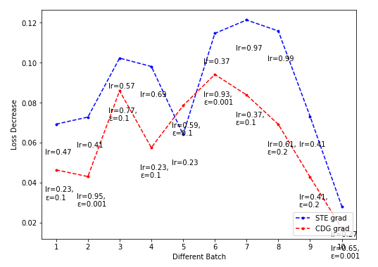
上面的效果其实挺差,因为没有调好xytext。
完整显示底层标注
有可能因为把标注竖过来写,导致底部显示不全,此时需要把下面的空白扩大一些,用这行代码就好:
plt.gcf().subplots_adjust(bottom=0.15)